

Making Your Print Stand Out
/
Hello folks,
I was doing some minor rearranging of my office and storage area and it spawned an article idea that I realized might be of interest to you.
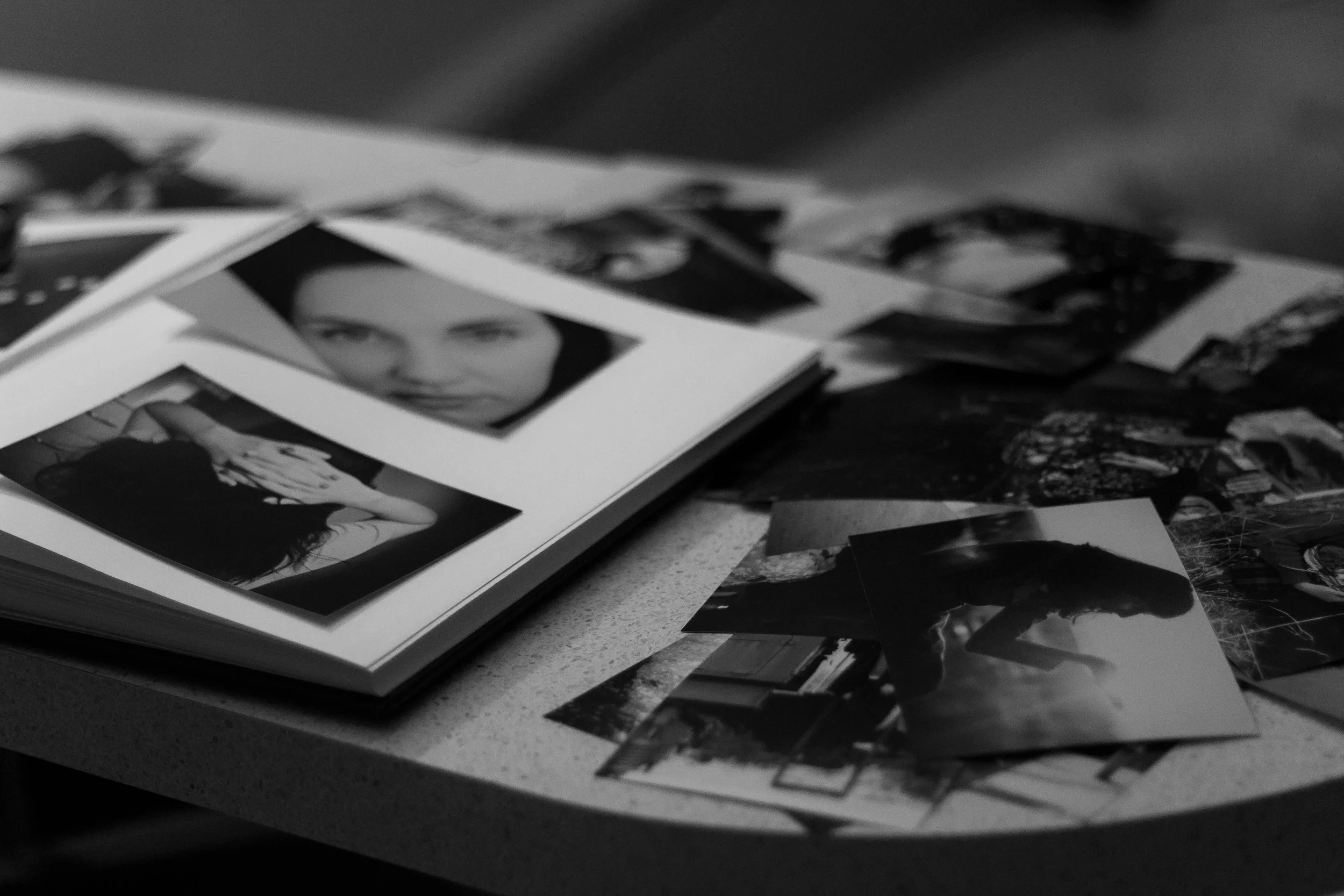
You’ve heard me say / write on many occasions that a photograph is not finished until it is printed. Ideally that means framed and on the wall, but space can be an issue, and others in the household may be less amenable to the idea. They’d be wrong of course but as Vonnegut would say “say it goes”.
For many folks who like prints, the solution is a print house. Whether that is a low cost option like a print jobber who makes nice print or a dedicated photograph printer like WhiteWall (https://whitewall.ca) either can serve the needs / wants pretty well. A higher end print shop, will often offer a small selection of different papers and that is where I want to spend some time, but for the sake of clarity, leveraging paper options tends to live in the realm of making your own prints at home.
This isn’t a treatise on picking a photographic printer. If that topic is of interest, please let me know. What I want to converse on today is photographic paper, specifically the paper surface.
Let’s Talk Paper
For years, resin coated papers were poo-pooed by some because of shorter longevity and limited surface types. While surface types are still limited, the longevity of RC papers is now typically thirty years, more than enough for most. So I am going to jump that discussion, and get to surfaces. What we all discover is that surface variety increases dramatically when we look at non-resin coated papers.
There’s a caveat here. Non RC papers allow the ink to soak into the paper, not lie on top of the resin level. This means a longer drying and set up time and that means that you really should never judge a print by what it looks like as it comes off the printer. Give it a day, two days is better before passing judgement. This presumes of course that you have predetermined the colour and brightness correct before making your “final” print. I’ve written about this before, but if anyone wants a review, just shoot me an email.
Finding a wide variety of surfaces requires either a sample pack, a sample card set or a visit to a serious photography shop that understands printing and carries the higher end papers. While the printer maker papers are not bad, some quite nice, they are bought off rolls from other makers. In fact, there is only one photo paper maker left that still makes their own paper from start to finish and that is Hahnemuhle.
Let me say up front that I receive no commission or reward from this company. After years of doing fine art printing, I can say that I have never been disappointed and that I have found the widest surface variety from Hahnemuhle.
Surface Types
Mostly we are familiar with gloss, matte and some kind of semi-gloss surface such as a lustre. These surfaces have no texture to speak of, in the manner that the paper texture contributes to the look of the print.
Where the magic happens is when the texture is rich enough that it contributes visually to the look of the print. A simple example is canvas, which gives a sense of depth and richness akin to what we would see from an oil painting. Printing on canvas is easier today than ever, and there are commercial stretcher kits that make preparing the canvas for display simple if one just follows the instructions.
But let’s go beyond canvas. It’s hard to describe a texture without seeing and feeling it. As fine leather makers will talk about the “hand” of different leathers, so to do fine art printers. Years ago, my friend Paul represented Hahnemuhle in Canada through their distributor and he and spent time in coffee shops feeling the hand of different papers. We probably looked like weirdos to others, but the feel along with the look is important in selecting a paper.
We also understand that different surfaces serve different subjects better than some others. Particularly if your love is black and white printing, the surface texture really becomes powerful due to the lack of the distraction of colour.
I enjoy textured papers and have at least one box or roll of each of the Hahnemuhle Fine Art Matte papers. Note that textured papers are almost entirely matte finished meaning that they look great behind glass when hung. Glossy and lustre can have internal reflections between the print and the glass and while it won’t bother some, I really dislike it and so don’t do it. You be your own judge.
From the fine texture of Museum Etching and Albrecht Durer to the deep textures of Torchon or German Etching, I find options for surfaces that support the story of the image. Sure it’s a bit more work, more test prints and yes a higher cost for these superlative papers, but for folks like myself, it’s completely worth the investment considering that these prints will long outlive me and hold up without fading or colour change.
If you want to try this out for yourself with your own photo printer, you are encourage to get the Hahnemuhle Fine Art Textured Sample Pack. It’s a very inexpensive way to discover textured fine art papers.
In the past I have discussed different ink types. This is defined by the printer maker. For simplicity we will encounter dyes (coloured but transparent) or pigment (coloured and not transparent - like paint). Lower cost printers will use dye, true photo printers will use pigments. I and most fine art printers only use pigments, but if your printer uses dye ink, don’t let that stop your experimentation. Pigments tend to last longer but may not have as much pop to colours. Some printers include a clear coat option, others don’t. To me it doesn’t matter for reasons forthcoming and none of my printers have this clear option so I don’t miss it. If you are doing fast prints on RC papers where the ink sits on the resin, the clear coat can serve as a gentle protectant. This doesn’t mean that fibre based, linen based or plant based papers don’t need protecting, but remember that they absorb the ink so it’s a different song.
When I print on a fine art paper, I let the print dry and setup for several days. Then I spray on a coat of Hahnemuhle Print Varnish. Varnishing comes from oil painting used as a surface protectant and in today’s world also as a protection against the denigrating effect of UV light. The only hassle is that the stuff is hard on your lungs so where a mask and spray in an area with decent airflow.
Mounting and Display
Even if the print is only going to live in a portfolio case, I always will mount the print to some hard matte board or more often acid free foamcore. You can get this in preset sizes or buy the cutters and learn to cut it yourself. Matte board is better but harder to work with. If you go with foamcore, thinner is better than thicker because dents are less visible.
I have had enormous success with the non-toxic and acid free 3M Photo Mounting Spray adhesive. It has a medium set up time so you get the orientation right and then I use a firm rubber roller from the art supply store to ensure that there are no air bubbles left behind.
Once mounted the print is ready for the portfolio or the wall in a frame. But there is one more step I encourage consideration of.
A frame in the old days was its own work of art with wide edges with complex and beautiful carvings in the wood and often a really spectacular finish. While still used for paintings, these frames have fallen out of favour for photographs, but as always, make up your own mind.
I like very minimalist frames, really just to get the photo a bit off the wall. For me, simple is best, but make your own call. Where I find myself much more often is the use of a matte around the photograph, to create separation from the frame and the wall finish. Use of mattes around the photograph can also resolve issues between the paint colour on the wall and the colour or lack thereof in the print. Many frames include a sheet of glass as a protector. It’s in your best interest to get frames that use UV resistant glass to prevent fading and colour shift.
If you print to the so-called standard sizes, you can find precut mattes reasonably easy at a big box art supply store. Some of these stores will even custom cut mattes for you which is worth the cost unless you are prepared to buy your own matte cutter and learn to use it which will involve a lot of learning curve and material loss. I have my own matte cutter, but have to mentally prepare myself for its use, and spend some dedicated time with scrap pieces to get my cutting skills back to where I need them to be. A nice matte can either have a square edge or a diagonal cut, whichever serves the image best and some mattes have multiple layers to create separation layers in the matte itself. This can be very powerful so long as it does not take away from the image. The job of the matte and the frame is to keep the viewer in the photograph not to distract.
Wrapping Up
So to summarize, I advocate trying papers with different surface textures to learn which textures work best for what types of images you create. Then mount them so they don’t wrinkle or crease and hold their shape. Then consider a matte to extend the size of the image and further create viewer isolation from distracting backgrounds and finally if going on the wall, use of a frame that displays the image well but doesn’t distract.
Thanks as always for reading. Send questions or requests to me via the link on the page. Until we speak again, be well and enjoy what you do.


